

Let’s talk a moment about the first thing to look for when selecting a design for your new website, the so-called “Holy Grail”, of web design: Responsiveness.
“What’s responsiveness?” I can hear you saying because you haven’t found the listening devices yet. Responsiveness is your website’s ability to look good no matter the aspect ratio it’s displayed in.
“What’s an aspect ratio?” I hear you sayin-
Look, I don’t have time for this. Have a look at the unauthorized fansite for our biggest fan: Lorenzo Lamas, The Renegade™. “Well that’s not so bad.” You say. “After all, I used a computer once in 1996 and haven’t seen another one until this very moment and that’s exactly what I remember a website looking like.” Well yeah, and that would be… Fine? I guess? If everyone didn’t carry a computer ten times more powerful than that computer in their pockets with a screen one sixth the size. Let’s use a lovely little tool called the responsinator to look at that same website on that iPhone 3 you’ve been meaning to upgrade… Without the shattered screen, of course.
Renegade Fansite On The Responsinator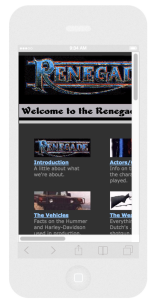
Notice how you can’t see everything? You have to zoom in or out on elements and then scroll up and down and side to side and it’s confusing and inconvenient and far less intuitive than it should be. Now take a look at one of our client’s sites on that same range of devices.
IP/LS Intellectual Property Litigation Support On The Responsinator
Go ahead and scroll around. Take a look at that site on all the mobile devices listed there. You won’t find a single one that page doesn’t look good on it. Notice how all the page elements arrange and re-size themselves so you only have to scroll up or down? No side to side, no zoom, and everything is legible. That’s the Holy Grail of web design.
That’s because here at Renegade websites we work in WordPress and we always suggest and customize themes that have excellent responsiveness. In this new informational frontier you want your viewers to be able access your website when they want, where they want, on the device they want without zooming or scrolling side to side. NO ONE WANTS TO ZOOM OR SCROLL SIDE TO SIDE, YALE SCHOOL OF ART!
So when you do decide to finally update that Geocities page you started twenty years ago remember the Holy Grail and don’t choose wisely.